About Us
Our Logo
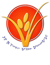
 Mornings come gloriously in San Leonardo, with the rising sun spreading its warmth and energy across the rural landscape in omniscient rays. Just like the town of its birth, the New Rural Bank of San Leonardo takes energy from the sun in the red circle of its corporate logo, significant of the fiery energy harnessed by the Bank and its people in its crusade for poverty alleviation and the development of local economies.
The rice stalk with its golden strands and grains in the logo signifies the boundless wealth of the countryside waiting to be tapped. The stalk defies restrictions, and unbounded by the red circle reaches out to explore and expand. Just like NRBSL that draws upon and transforms that wealth into a dynamic tool for emancipation from the bondage of poverty.
Never failing to look back and appreciate its humble beginnings, the calligraphic alibata of pre-historic Philippines at the bottom fringes of the logo's red circle, translates into what the Bank believes in - Una sa lahat ang mahirap! or The poor come first!
